

Product Design - Mobile
Overview
Signos is a health and wellness app that uses continuous glucose monitoring (CGM) along with lifestyle changes to help users understand how their body responds to food, exercise, and other daily activities. It helps users track and manage their personal health data. The redesign focused on overhauling the user interface, streamlining critical features such as glucose monitoring, predictive meal logging, and personalized activity recommendations, and creating a cohesive experience. Key areas of improvement included the home screen, reports section, meal logging, and settings, with the overarching goal of empowering users to take control of their metabolic health and make informed lifestyle choices.

My Role & Contributions
Though I was the sole product designer on the team, I worked very closely with a team of engineers and stakeholders. This forward-thinking work aimed to inspire the team to align the app’s visual identity with its long-term goals.
I was responsible for:
Conducting initial research and gathered feedback from team members and stakeholders.
Redesigning the app’s UI and updating branding.
Exploring future possibilities for the app, including what the product could look like with a complete branding overhaul.
Developing an experience map to align the team on user flows and priorities.
Collaborating with engineers and the data team to implement design solutions.
Advocating for user-centered design practices.
Conceptualizing a companion Apple Watch app, focusing on extending core functionalities such as glucose trend alerts, quick meal logging, and activity recommendations directly to the user's wrist.
Problem - Home Screen
Users struggled to quickly understand their glucose trends and take actionable steps to manage their health. The existing home screen lacked clarity in presenting glucose changes, alerts for significant trends, and tools for contextualizing events that might impact glucose levels. This led to difficulty in maintaining optimal glucose control and achieving health goals like Time in Range (TIR).
Home Screen
The home screen served as a central hub for the user, providing a comprehensive overview of their glucose data and actionable insights to support better health management. It displayed the user’s current glucose value, time in range (TIR), and any relevant notifications. A daily glucose graph allowed users to visualize trends, while a timeline of events—referred to as Points of Interest—helped contextualize changes in glucose levels. Additionally, the home screen offered an intuitive way to add events directly to the graph, enabling users to log activities such as meals or exercise and see their impact on glucose trends.

By default, a user can log an event to any point on the graph by dragging.


Problem - Points of Interest
Users often failed to log activities or events that might impact their glucose levels, such as meals or exercise, leaving the system with insufficient context to interpret sudden changes in glucose data. To address this, the algorithm triggered Points of Interest whenever a significant glucose fluctuation occurred. These markers served as visual prompts on the glucose graph, encouraging users to log relevant details. The challenge was to visually represent these Points of Interest in a clear and intuitive way while creating a logging experience that users found engaging and effortless.
Points of Interest
Points of Interest are algorithm-driven prompts that appear on the glucose graph when sudden changes in glucose levels are detected. These markers encourage users to log activities like meals or exercise, helping the app gain contextual insights to refine glucose trend analysis and provide more accurate, personalized recommendations.

When the user reaches an unknown Point of Interest (generated by the algorithm), they have the ability to fill in the missing information

Tapping on the POI, the user can choose from a list of events to add to the graph.
Log
On the log screen, users needed an efficient way to view POIs and the ability to quickly log relevant details or dismiss the notification if it was unnecessary.
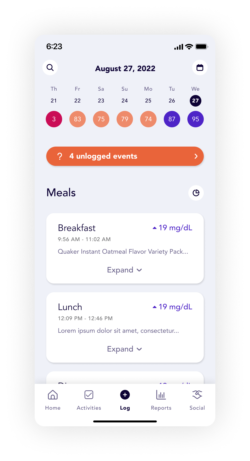

Problem - Meal Logging
The meal logging experience lacked alignment with real-world eating habits, offering a disjointed experience that made it difficult for users to log meals effectively or in a timely manner. Users needed a streamlined way to log meals with varying levels of detail while receiving actionable insights, such as predictive glucose responses or activity recommendations.
Log Screen
The log screen introduces a streamlined interface that allows users to select and log specific events such as meals, exercise, body measurements, sleep, water, and other activities. By utilizing a dropdown menu for event selection, users can quickly access detailed logging options tailored to each activity type.

What happened?
The user chooses from a list of options that dictate the details below.
When?
Combining the date and time input simplifies the process, enabling users to achieve their goal with fewer taps.
Duration
The user has the option to add a duration of pre-set time durations or leave it blank.
Meal Type
Specific to the Meal event, meal type allows a user to group their meals into a category.

Log Meal Page
The log screen introduces a streamlined interface that allows users to select and log specific events such as meals, exercise, body measurements, sleep, water, and other activities. By utilizing a dropdown menu for event selection, users can quickly access detailed logging options tailored to each activity type.
Meal Logging
The meal logging page is designed to minimize barriers to meal logging by allowing users to provide as much or as little detail as they prefer. Users can log a quick note and save their meal or add detailed information such as individual meal items, notes, photos, and tags. This flexibility ensures that meal logging is quick and accessible, while still offering the option to enrich the data for enhanced functionality.

Adding a meal item
The Add Meal Item screen simplifies the process of selecting and adding one or more items to a meal. Users can search for food items using a search bar or easily scan the barcode for their item. They can explore tabs such as Recents, Favorites, and Custom to quickly locate frequently logged items or personalized entries.


Meal Details
Once a meal item has been added, the user can see exactly how this will affect their glucose and what they can do to mitigate any negative effects.
Glucose Impact
If users log meals in detail at least 30 minutes before eating, the app leverages this data to provide predictive glucose responses based on their current glucose level and actionable recommendations, such as healthier substitutions or activity suggestions to mitigate glucose spikes.
If the meal is logged outside of that time window, they will see a basic predictive glucose graph.
Note
The quickest way to log a meal is by adding a quick note, allowing users to capture essential details with minimal effort. A planned future enhancement involved leveraging AI to analyze these notes, automatically extracting relevant information to populate meal details or using the note content to generate personalized reports.
Photos
While entirely optional, photos provide a valuable visual reference, helping users recall what they ate and easily distinguish between different meals.
Tags
Tags provide an additional layer of detail, making it easier for users to search for and categorize specific entries. A planned future enhancement involved leveraging tags to generate personalized reports, offering users deeper insights and trends based on their tagged activities or meals.
Problem - Reports
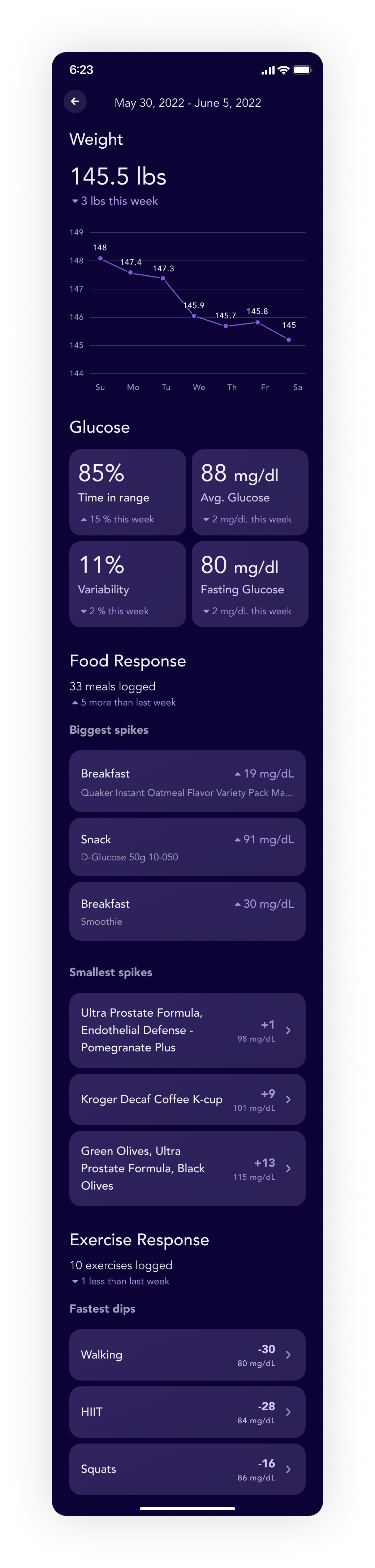
The reports section of the app was redesigned to deliver clearer and more actionable insights into users' health data. Previously cluttered and difficult to navigate, the reports were transformed with clean, minimal graphs and charts that made trends and metrics more easily understandable. However, the original charts posed additional challenges as they were not intuitively designed, and many interactive functions were hidden and unclear to users. A significant challenge during the redesign was determining how to best present data over time—whether through individual data points, averages over set periods, or by using rolling averages.
Weight
Visualizing weight proved to be a particularly challenging task. Since weight is best understood as a trend rather than isolated data points, we needed to design a visualization that emphasized average weight over time. The goal was to present this information in a way that was encouraging and focused on progress, ensuring users weren’t discouraged by normal fluctuations in their weight data.

Clear time ranges
By showing the clear time ranges along with the average value, we were able to push the user to look at weight as an average over time.
Goal Setting
Goal setting played a crucial role in the user journey within the Signos app. By allowing users to set and visualize their goals in context, we fostered motivation and encouraged them to stay focused on achieving their targets. This integration helped users track their progress and remain engaged in their health journey.
Chart data points
Allowing users to select a specific data point on the chart empowered them to gain precise insights into what occurred at that moment in time, giving them greater control over understanding their data and its context.
Average Glucose
Average glucose was a key metric we aimed to help users track over time. The visualization needed to incorporate a target range goal, along with a clear indicator showing whether glucose levels were trending upward or downward compared to the previous measurement period.


Problem - Settings
The settings page required a design that offered users highly detailed control, particularly over sharing preferences due to the sensitive nature of personal health data displayed in the app. It was essential to provide a solution that allowed users to precisely choose who could access their data—or opt to keep it entirely private—ensuring both flexibility and peace of mind.
Total Privacy
We needed to accommodate users who preferred to keep all their data completely private. This included offering the option to maintain a private profile and disable data sharing entirely. It was crucial to present these choices clearly and intuitively to avoid any potential confusion, ensuring users felt confident and in control of their privacy settings.

Levels of Privacy
If a user chose to share their data, we ensured they had granular control over their privacy. They could opt to share their data exclusively with friends or make it accessible to everyone. Within both options, users retained the ability to customize their sharing preferences further by selectively sharing or hiding specific data from certain individuals. This flexibility allowed users to maintain control over their personal information while fostering trust and engagement.


Future Ideation
As part of this project I had the opportunity to dive into some future ideation. This included envisioning a complete branding overhaul, exploring how the app could look and feel with unlimited resources to push the design boundaries. Additionally, I conceptualized a companion watch app that could seamlessly integrate with the mobile experience. The watch app would enable features like real-time glucose notifications, quick meal logging, and activity recommendations directly from the user's wrist. Together, these explorations provided a vision for how the app and its ecosystem could evolve, creating a more cohesive and powerful tool for users to manage their health.