
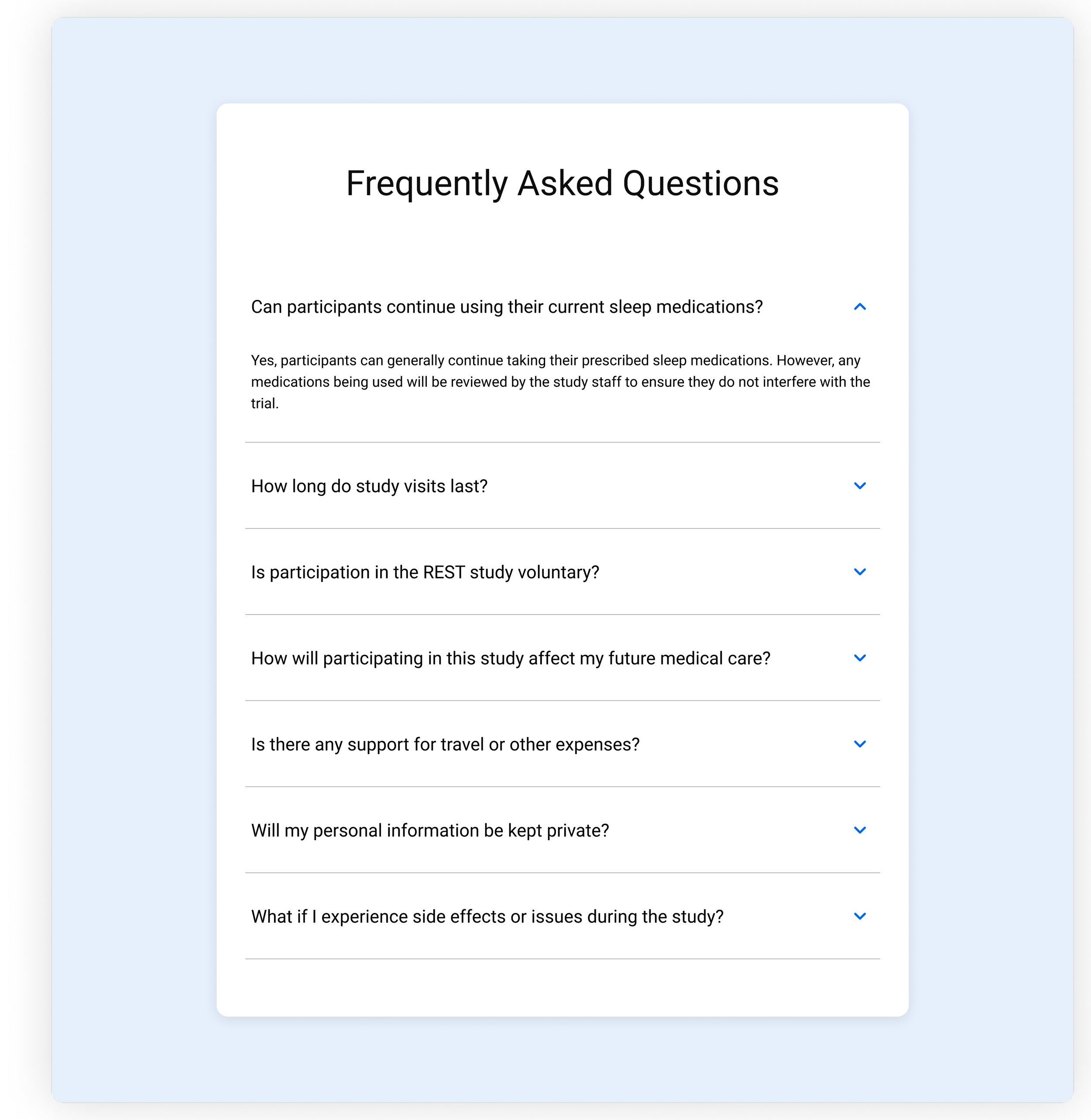
Product Design - Web and Mobile | Research | Testing | Branding

Overview
TrialSync is a comprehensive, white-labeled platform built on a content management system that transforms clinical trial management by connecting participants and professionals through integrated tools. Participants access a web portal for study enrollment and a companion mobile app to track data needed for the study. Clinical professionals leverage a robust web portal to manage participants, professionals, and view detailed data visualizations. Designed to enhance efficiency, compliance, and collaboration, TrialSync simplifies trial management and empowers researchers to focus on driving innovations in healthcare.

My Role & Contributions
As the sole designer on the team, I was responsible for the experience of all products from end-to-end collaborating with a product manager, multiple engineers, and several stakeholders.
Designed all products in the TrialSync suite including all wireframes, UX flows, prototypes, and high fidelity WCAG compliant screens
Designed a robust white-labeled portal for clinical trial management
Designed a white-labeled companion mobile app for participants to stay compliant by tracking health data, performing tasks, and answering surveys
Designed a white-labeled website to optimize participant acquisition by giving an overview of the study and walking them through the enrollment process
Designed all emails sent through the TrailSync system (white-labeled)
Created a design system for each product.
Conducted usability testing and research to validate designs and inform iterations.
Problem - Professional Portal
Design a centralized, flexible, and secure portal that supports multiple studies, sites, and participants while accommodating multiple user roles with tailored permissions. It must be white-labeled for trial-specific branding, manage participants and their associated devices, and provide comprehensive data visualization and export functionality. Additionally, it must integrate seamlessly with various devices and the companion mobile app, ensuring all data flows into the system. To meet clinical trial regulatory standards, the portal requires a robust audit trail, secure login functionality, and consent form management. The solution must also support easy navigation across studies, ensuring scalability and ease of use for all stakeholders involved in the trial.
Login
Login was particularly challenging given the requirements for compliance as well as some unique workarounds engineering needed to do for database purposes.
It would need to be a multi-step process with checks along the way to ensure a user was being routed to the proper study.

Step 1 - Enter the Study ID
This allowed the system to route the user to the correct database for the study.

Step 2 - Enter the credentials for the study
This required a check on the backend to make sure this participant had the correct credentials for the study ID they entered on the previous step.

Step 3 - Enter the Verification Code
Another step that needed to be implemented was two factor authentication, which could be bypassed by allowing the user to select to remember the device until they manually logged out.
Validations
There were validations along the way for issues with passwords or the account as a whole.


Create Password
Because the participant was enrolled by a professional, they would have received an email with a link to create their account. The challenge here was to make sure that we were able to capture the password requirements while staying CFR Part 11 compliant.


Participant Details
The participant details screens were some of the most complex because they had to house so much information: all of the data from devices and the companion app, all of the manually logged activities, forms and surveys, errors and notifications, device details, consent forms, and all the functionality to manage the participant. In addition, the professional needed a quick way to refer to the participant ID and status as well as be able to see the most recent flags and tags for the individual.
Participant Details Header
This header would serve as the navigation point for all of the participant details. The user would be able to navigate back up the trail of breadcrumbs should they get too deep and need to return. There would also be a constant view of the participant information, flags, and tags for the professional to address quickly.
The biggest benefit of this header was the tabbed navigation. After several iterations of tab size order, we came to the final version which made the most of the screen real estate and accounted for localization and some white labeling.

Data Tab
The Data tab had a lot of necessary requirements.
The user needed to be able to choose a date range for the data. This could be a pre-defined range of time or a custom time range. (Which meant we also needed a date picker)
The user needed to be able to export the data to a CSV file
During study creation, the admin could create different types of data that they would need to see specifically, so we needed to make sure we had a way to present that information cleanly
The user needs a way to see which data is out of the range that was set in the study builder. (an alert)
The tabbed table allowed us to give the user an unlimited number of data types to track. Each row would allow for one week of data that the user could then click into for more granular inspection.
The highlighted fields would serve as alerts if a number was out of range, so the professional was able to quickly assess any issues.
Date Picker
The date picker presented its own set of challenged. It needed to have a pre-determined list of time ranges as well as the option to choose a custom date range. In the custom date range picker, the user would be able to choose a maximum of 90 days. This needed to be clearly communicated to the user. It also needed to be easy to choose up to 90 days. This was achieved by giving the user a 3 month view, so they never had to guess which was the final day they could choose.


Data Details
By clicking into a week row, the user would be able to see more granular data for the week selected. We didn’t want to limit them to one week only though, so we created a way for them to click from week to week without having to go back up a level to the table view.
For even more granularity, the user could switch to the day view to see the data broken out day by day.
Both the week and day view would show the data from the table as well as any alerts or notification in more detail, so the user always had a quick way to scan to see any issues with the participant.

Profile Tab
The Profile tab was the primary place for the professional to manage the participant. We needed to account for multiple roles (with multiple permissions) using this tab as well as any information that needed to be blinded based on the study.

Device Details Tab
The Device Details tab needed to be able to show an entire history of devices for a participant. It needed to tell a story.
In this example, the user has several different devices associated with their account - 2 types of medical devices, 1 software “device,” and 1 hardware device. Each device needed its own section as well as details about the most current device that was active. We also needed to include the history of that device and any other device that came before it.
Medical devices, specifically, can get very complex very quickly, so we needed a way to display the information in a very logical way.

Participant List
One of the biggest challenges for the Participant List was figuring out which columns were necessary to show and which could be shown under the details section. The list would need to be filterable as well as searchable. There needed to be clarity on how many participants were being shown vs how many were available overall. We needed to accommodate space for the Site Name (which could have been anything) as well as space for Flags (system generated) and Tags (User generated).
Search
At the beginning of the project, we were only going to search for Participant ID, but after some early testing, we found that Professionals wanted to be able to use the search to filter as well.
Tags
Tags are a very important part of the Participant List functionality. A user should be able to add a custom tag to a participant that they can re-use. They would also need to be able to go back and edit the tags that were applied to the participant.

Create Participant
There were many moving parts to creating a participant.
The Site list needed to be pre-populated, and based on the user and their permission, they might only have the ability to access 1 site.
During study creation, the user could choose which contact methods the study would be using — phone number, email, or both. The professional would need to choose a primary contact method in the modal. Then, based on what was chosen, the options below would update to include only what was required.
The phone number would need a country code since we wanted to accommodate our global partners.
Trial Phase needed to be chosen, but the list was populated during the study creation.
This all needed to be taken into consideration when designing this simple modal.

Join Study
Because we already had the functionality to switch to create a study and switch to a different study, we needed to create a way for certain professional role types to be able to join a study. They needed to be able to see a list of all the studies they could join and a way to join.
Study Selector
After implementing the study selector to switch between studies, it seemed like the logical place to add in other study-specific features like creating a study and joining a study. The study selector lives in the header and is visible on every page of the portal for easy access.

Join Study Modal
After selecting Join Study from the study selector, the user was presented with the Join Study modal where they could see which studies they had already joined as well as search to filter the list of studies, and select a new one to join.

Study Admin Section
The Study Admin Section (only visible to certain roles) provides comprehensive tools for managing both the professionals involved in a clinical trial and the trial itself. Administrators can invite, delete, create, activate, deactivate, and unlock professionals, as well as assign specific roles tailored to their responsibilities. Additionally, the system allows for managing seats and licenses for the study.
This section also enables site management. Administrators can oversee study-specific configurations, such as adjusting the number of seats allocated to the study, editing key study details, or even deleting studies when necessary.
Designed for flexibility and control, the Study Administration section ensures seamless management of professionals, sites, roles and resources.
Professionals Tab
Must like the participants list, the professionals list had similar challenges. The list would need to be filterable as well as searchable. There needed to be clarity on how many professionals were being shown vs how many were available overall. We also needed to accommodate space for the site access and make sure we could show the Role and the blinding permissions.

White Labeling Challenge
Though the functionality of the Portal was challenging in itself, white labeling it came with its own set of challenges. The system was built on a content management system, so we did, theoretically, have the ability to let the trial customize every single thing. But should we?
Do we allow them to white label everything or just chosen components?
If we allow them to customize everything, do we go as granular as something like corner radii?
Does the white labeling include a custom typeface?
How many colors should we allow the trial to customize?
Ultimately, we chose to keep the white labeling very simple for v1 and gather feedback on whether any of the clients would prefer more.
Navigation and Tabs
By allowing minimal white labeling with colors only, we were able to keep WCAG compliance while allowing some customization throughout the application.


Problem - Companion Mobile App
The existing mobile app for clinical trial participants required significant enhancements to effectively support its role as a companion to the professional portal. The app needed to collect and sync participant data based on the specific requirements of each study while ensuring seamless integration with the portal. Additionally, it needed to accommodate a range of customizable features, including white-labeling for study-specific branding. To meet the evolving needs of clinical trials, the app required improvements in usability, functionality, and scalability to better engage participants, streamline data collection, and maintain compliance with regulatory standards.
Selected screens below

Login

Home

Two Factor Authentication

Add Menu

Navigation Menu

Data Section

Log

Meal Details

Item Details

Add Item

Data Sources

Device Details

Replace Sensor

Start new sensor
Problem - Participant Recruitment Site and Email Communications
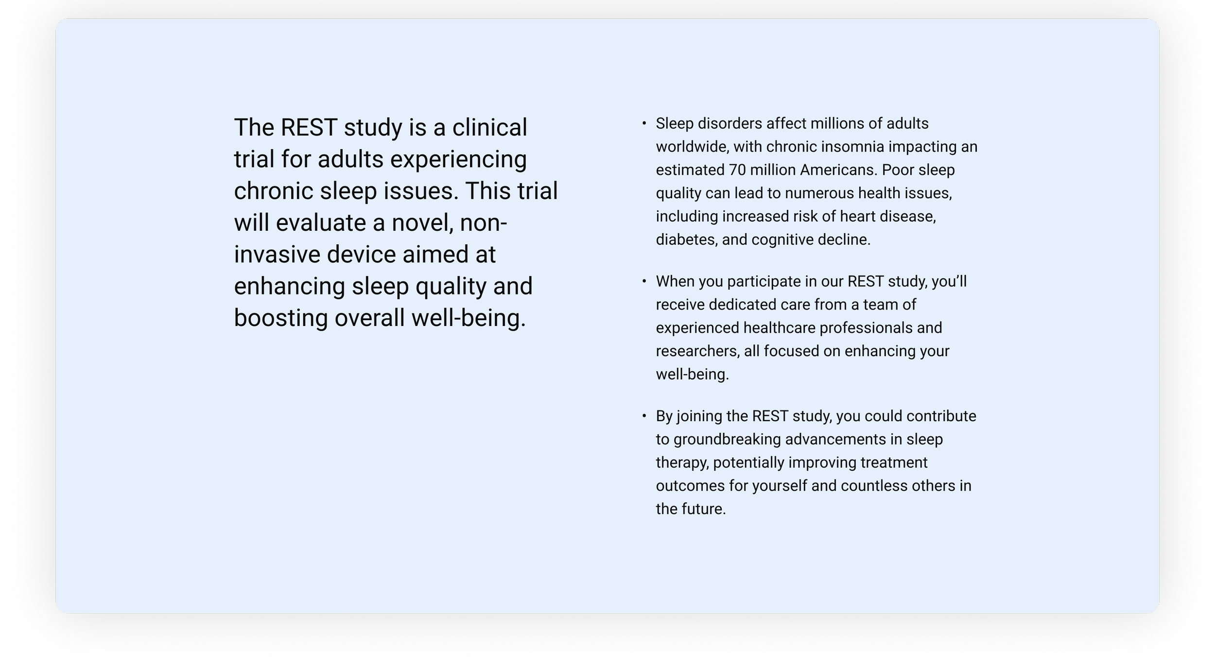
The recruitment site needed to serve as an engaging and informative entry point for potential clinical trial participants, streamlining the process of enrollment and ensuring alignment with the trial's goals. It required a clear and accessible design to provide detailed study information, guide users through pre-screening and screening questions, and facilitate seamless site enrollment, including all documentation that was required. Additionally, the site had to integrate with the TrialSync portal, capturing participant data efficiently while supporting white-labeling for study-specific branding. The challenge was to create a recruitment platform that balanced usability, compliance, and adaptability to meet the diverse needs of each clinical trial.
To complement the recruitment process, a series of white-labeled emails were created to align with each step of the participant journey, from initial awareness and pre-screening to enrollment and onboarding. These emails feature clear messaging, tailored branding, and actionable links, working in tandem with the landing page to ensure participants are supported and engaged throughout the recruitment process.
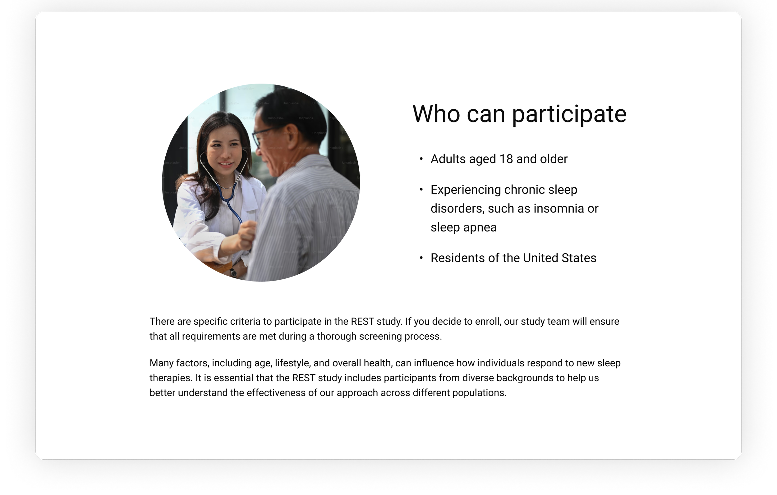
Landing Page
The recruitment site landing page was designed to be a flexible and adaptable platform capable of accommodating the unique requirements of various clinical studies. It features interchangeable sections, allowing for customization to include study-specific information while maintaining a consistent structure. Accessibility and white-labeling were prioritized to ensure compliance and seamless branding for each study.

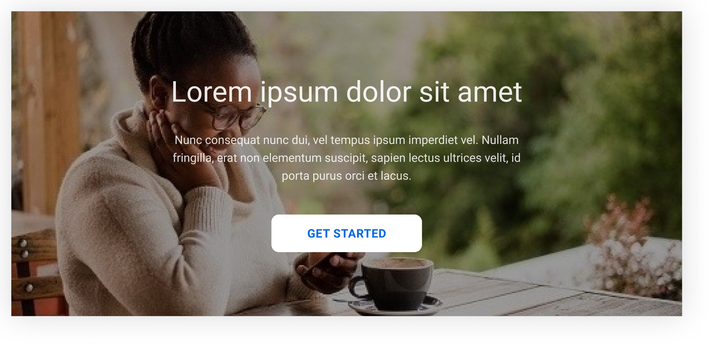
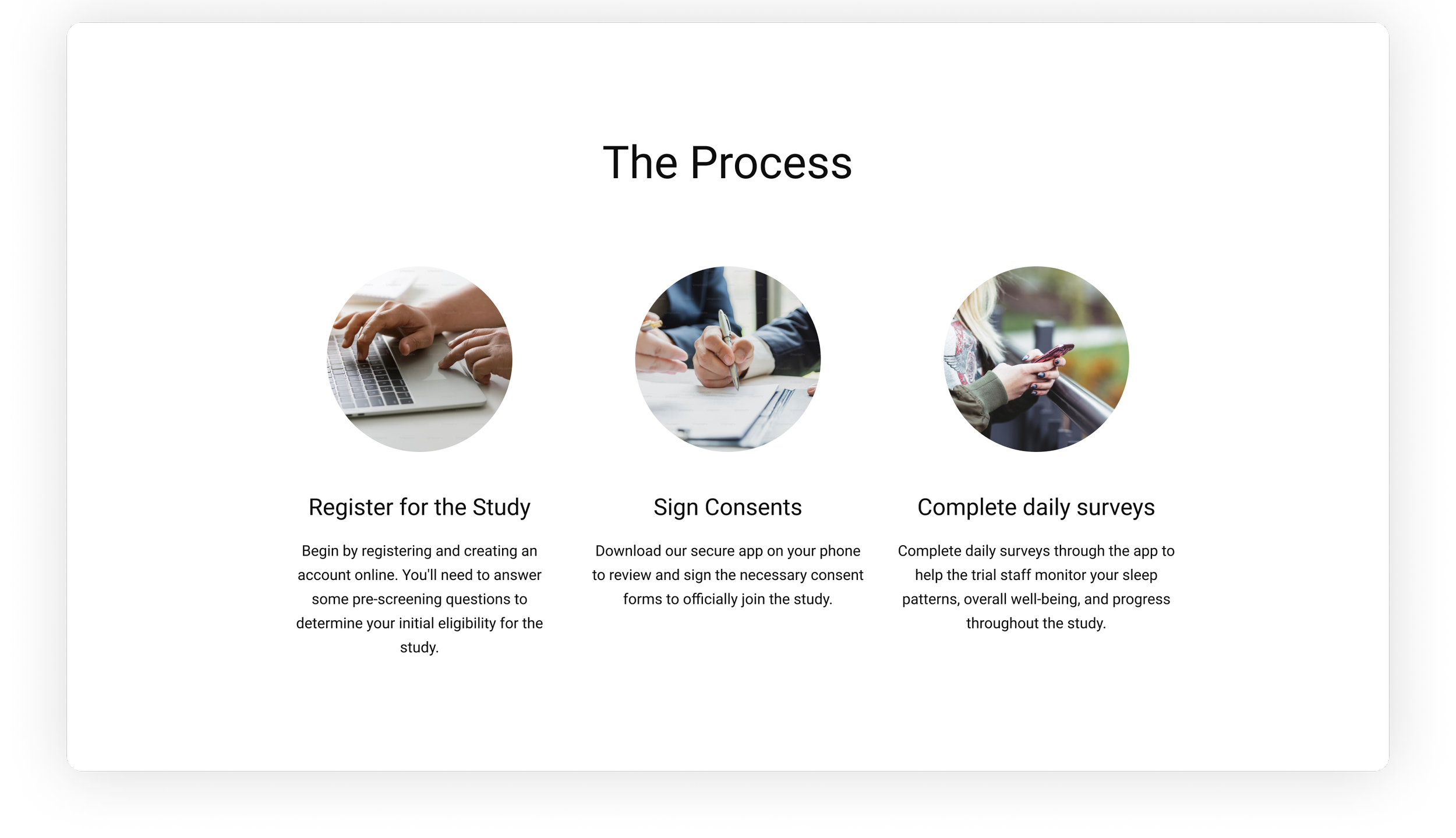
Once the user chose to get started, they would be taken through the process to enroll in the study.
Pre-Screening Form
This form was created to collect basic information about the user. It included text fields, dropdowns, radio selections and a section to create an account.

Welcome Email
Once the user had created an account, they would receive a welcome email with instructions on how to activate the account.


Login
Once the account was activated, the user was asked to login to continue to process.

Choose a Site
On first login, the user was asked to choose a Site to register with. Because each Site was set up to have its own enrollment process, this was a very important step.

Documentation
Because each Site’s enrollment process was customizable, we needed to account for as many steps as necessary for the consent process.

Optional Final Screening
There was the potential to have a final screening questionnaire, so we needed to make sure to account for that as well.


Participant Portal
Once the user was officially enrolled in the study, they landed on their own portal which would contain information about the study and next steps in their journey.


